Customize checkbox using CSS
In this tutorial, we are going to see how to customize checkbox button using CSS. If you try to style the checkbox buttons directly using CSS properties like “background” or “border” it will not work, as most form elements are native to browsers and do not support so many visual styles. So we have to find another way to style the checkbox buttons.
So how to customize checkbox buttons with CSS. Just copy/paste the following HTML/CSS code:
HTML Code:
<!DOCTYPE html>
<html>
	<head>
		<meta charset="UTF-8">
		<title>Customize checkbox using CSS</title>
	</head>
	<body>
		<label>
			<input type="checkbox"><span>Software development</span>
		</label>
		<label>
			<input type="checkbox"><span>Web development</span>
		</label>
		<label>
			<input type="checkbox"><span>Mobile development</span>
		</label>
	</body>
</html>
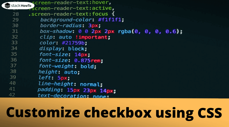
CSS Code:
label {
	display: block;
	cursor: pointer;
	line-height: 2;
	font-size: 1em;
}

input[type="checkbox"] {
	position: absolute;
	opacity: 0;
	z-index: -1;
}

input[type="checkbox"]+span {
	font: 16pt sans-serif;
	color: #000;
}

input[type="checkbox"]+span:before {
	font: 16pt FontAwesome;
	content: '\00f096';
	display: inline-block;
	width: 16pt;
	padding: 2px 0 0 3px;
	margin-right: 0.5em;
}

input[type="checkbox"]:checked+span:before {
	content: '\00f046';
}

input[type="checkbox"]:focus+span:before {
	outline: 1px dotted #aaa;
}

input[type="checkbox"]:disabled+span {
	color: #999;
}

input[type="checkbox"]:not(:disabled)+span:hover:before {
	text-shadow: 0 1px 2px #77F;
}
| Result |
|---|